Early Look at Android 12 Design
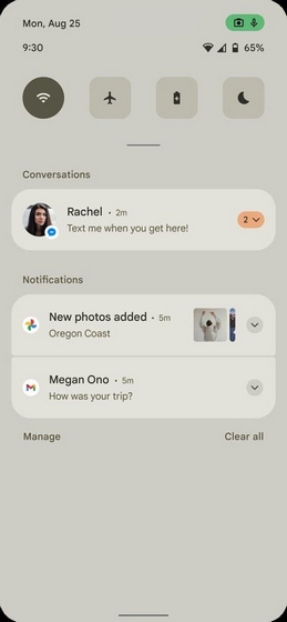
As reported by XDA Developers, the first obvious visual change is with the notification panel. Instead of the transparent notification shade, we now have what appears to be an opaque background that respects wallpaper’s accent. In a minor change, Google has swapped the positions of the date and clock in the left corner. More importantly, the number of Quick Settings tiles before expanding seems to be reduced from 6 to 4. Source: XDA-Developers
Camera/Mic Indicators on Android 12
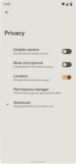
If you take a closer look at the image above, you’ll notice a pill-shaped indicator with microphone and camera icons. That is, indeed, the privacy indicator that Google has been working on since Android 10 – even before Apple made it mainstream with iOS 14. From the looks of it, tapping on these status bar icons may show a pop-up. This pop-up contains details of the apps accessing your phone’s camera or microphone. Speaking of privacy, Android 12 may improve the privacy settings with straightforward toggles to disable your camera and microphone. This is a welcome change, as not many users will be aware of turning off all sensors on Android (until they read our linked guide, of course.) Source: XDA-Developers
Conversation Widgets
Another visual change is an improvement to widgets, and it was expected as Apple brought an arguably better implementation of widgets with iOS 14. The leaked screenshots show a new ‘Conversations’ widget. It should help users quickly keep track of recent messages, missed calls, and activity statuses. According to XDA‘s report, Google will make conversation widgets and cam/mic indicators mandatory in Android 12. XDA mentions that the complete authenticity of the images can’t be verified as Android 12’s Compatibility Definition Document isn’t public yet. However, it does look like these images are legit. While I’m a huge fan of the privacy-friendly changes like the new toggles and camera/mic indicators, the reduction of QS tiles to four isn’t something I would enjoy on Android 12. Coming to the overall aesthetic, sure, it does look like a hybrid of iOS and OneUI at first glance, but the alleged theming engine should (hopefully) make a tangible difference in the experience.

