Good Lock is available via the Galaxy App Store for the US where searching for it would show up the app automatically, although it is possible for others to install it via an APK installation. However, it will still not run on devices below Android 6.0 Marshmallow and those that are not sporting a Samsung device, let’s be clear about that.
When you install Good Lock, the first thing that you’ll notice is the weird default color accent that Samsung chose. You see, all lock screen elements carry a really strange purple/dull pink accent, which is far from aesthetically pleasing, but it’s changeable, so that’s hardly a negative. The second most prominent change you’ll find is how the lock screen and notification shade resemble stock Android – from the indicators to icons to selection and layout, all of it screams stock Android. Whether it’s a good thing or bad depends on personal choice. I personally like TouchWiz’s icon layout and styling and find stock Android icons bland and plain, but there might be others who prefer the latter over the former, so we’re not making a judgement here. Other changes to appearance are most visible in app switcher/multitasking menu, as well as massive customizations to the lock screen. We’ll take a look at all the changes in some detail and one by one, but first let’s see how Good Lock can be installed.
Installing Samsung Good Lock
As we noted earlier, if you are in the US and have an eligible device (running Android Marshmallow at least), you can simply head to the Samsung Galaxy App Store and search for Good Lock, where it’ll show up in search results and can be installed. Alternatively, you can grab the APK from APKMirror, allow installation of apps from Unknown Sources and simply install the APK. Either way, you will end up with a running version of Good Lock once you restart your device. It’s worth noting that Good Lock will automatically take over your device’s lock screen once installed, and you will need to uninstall the app should you ever wish to revert to the original.
Lock Screen
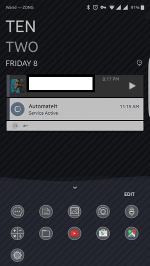
Since Good Lock is a lock screen replacement, it makes sense that the most vital changes it makes are to the default lock screen on your Samsung device. On first look, the biggest thing you’ll notice is a different clock style, as well as a list of apps at the bottom of the screen. Another difference is in the status bar icons that’s immediately visible, where they take on a stock Android look, but we’ll talk about them once we get to the Notification shade. There are quite a few things that you can do in lock screen now. Swiping down from the top of the lock screen will reveal the “widgets” area – a space where you can add widgets that can be accessed directly from the lock screen. You can add as many widgets as you like, and they will not clutter your lock screen unless specifically accessed through this gesture.
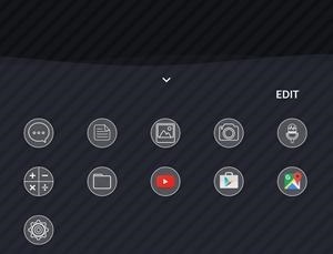
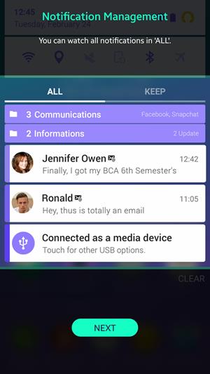
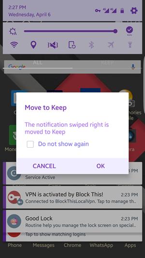
Swiping up from the bottom of the lock screen will pull a list of apps that is customizable. Generally, it’ll show recently accessed and frequent apps, but you can set “routines” within Good Lock that will change this app collection based on time of day, your location and other parameters etc. If you have tried the My Places edge feature on a Galaxy S7 edge, you’ll find this arrangement pretty familiar. Within the lock screen, there’s quite a lot more that you can do with the notifications that are displayed, including some swipe gestures. Swiping left on a notification will dismiss it, which is a pretty standard affair. If you swipe right on a notification, however, it gets moved to an area that Samsung calls “Keep” – a storage of sorts for notifications that you don’t want to dismiss but don’t have a time to address at the moment. You may access the Keep by pulling down the notification shade, where two button right below quick toggles separate the view: All and Keep.
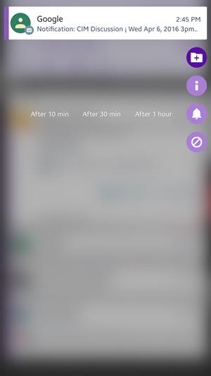
Whether a notification is in the All view or the Keep, you can press and hold on a notification to get further options: move it to a custom folder for better categorization, get the app’s notification settings easily, block the app from sending further notifications, or snooze the notification for a predetermined period of time. This is especially useful if you want to be reminded of something at a later point.
It’s worth noting here that if you repeatedly dismiss notifications from a particular app, Good Lock will offer to block it based on that behavior. Be sure to hit Cancel and not OK if you’re asked that, because OK essentially blocks notifications from that app – something that I learned the hard way.
Notification Shade & Status Bar
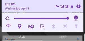
The notification shade is the second area that sees major changes to its interface under Good Lock. It’s totally stock Android – so much so that if you put it next to a Nexus phone, it’ll be hard to tell the difference. In its effort to mimic Google’s native UI, Samsung made some good changes and others that are plain stupid. For instance, I really hate the signal icons in stock Android, and that’s what you get with Good Lock. If you’re using mobile data, gone are the two little arrows that indicated incoming and outgoing traffic, replaced by a simple 4G written next to the signal strength indicator. The signal strength is also hit and miss now, because there’s no bars to tell you what the quality of your cellular signal is.
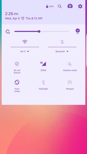
Moving back to the notification shade, pulling it down will give you the standard affair of quick toggles, although the order is now different. You get brightness slider with auto-brightness toggle, WiFi, Location, Sound toggle, Orientation, Bluetooth, Airplane Mode and Flashlight, and as far as I can tell, they cannot be swapped with others. Pulling once more on the notification shade adds some more options and takes away some in pure Nexus fashion, with the additions including Do Not Disturb and Hotspot.
At the top of this screen is also a button for quickly getting into device Settings, accompanied on the left by Good Lock settings, followed by a search button and then the battery percentage indicator.
Good Lock Settings
While we’re on the subject of Good Lock settings, let’s see what the app has on offer. Heading into settings gives you three primary options: Routines, Lock Screen and Uninstall. The last one is pretty self-explanatory, and the Lock Screen options basically allows you to set lock screen wallpaper, enable/disable color and add some effects to it. It’s the Routines, however, that are most interesting.
Routines
Routines are primarily location and time-based profiles that you can configure, which automatically enable if the selected criteria is met. There’s a default routine that’s preset on your device once you install Good Lock, and that’s universal, in that it’s applicable everywhere and all the time as long as another routine is not set. You can either make changes to the default routine (but you cannot bind it by time and location), or add a new one.
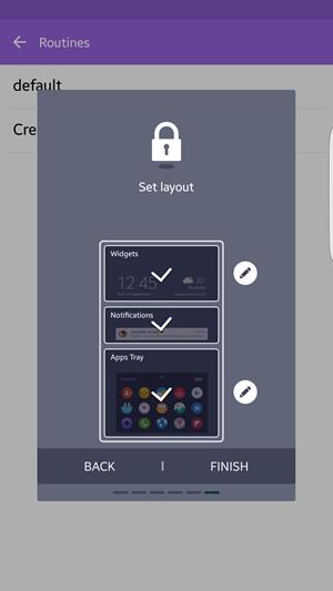
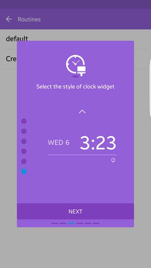
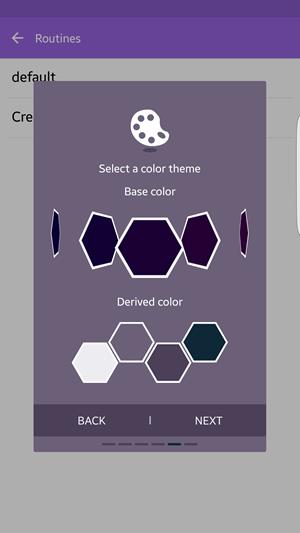
Adding a new routine first asks you to select the location where that routine will be applicable. Please note that location is determined by GPS signal and not WiFi or Bluetooth, for instance, so if you have location services turned off, it’s unlikely that they will work. You can skip setting a location and make the routine work “everywhere”. Next, you pick the start and end time for that routine. Then, you can select the lock screen clock widget style for that routine, where you have a bunch of options to pick from. Quick settings are next, allowing you to configure states for WiFi, Sound, Orientation Lock and Bluetooth for that routine. Color selection is next, where you get a fairly wide selection to pick from, and Good Lock will even show you the derived color accents from your primary color that it will use for icons, text etc. Finally, you get the layout, where you can follow the default order of Widget > Notifications > Apps, or change it to your liking.
A little note on the color picker. You’d recall I commented earlier on the weird default color that Samsung went with in Good Lock. Well, you can change that, but this is most non-intuitive color picker I’ve seen in recent years. It’s basically a horizontally scrolling list of colors with no indicator of an end on either side (although it does end), and despite having hundreds of colors to choose from, it’s really lacking in darker color choices (there’s no black at all, for instance). I mean, it would’ve made far more sense for Samsung to have gone with a standard color-picker palette – how difficult would that have been?
App Switcher
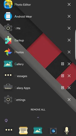
The final area that Good Lock makes changes to is the Multitasking menu or App Switcher, where it replaces the scrollable list of TouchWiz cards with a list of recent apps, accompanied by the apps tray at the bottom that carries over from the lock screen and is governed by the applied routine. An interesting feature in this list is that if an has an active location, the first letter of the app’s name will carry it’s icon color – useful to see which apps have outstanding notifications at a glance.
SEE ALSO: The Samsung Galaxy S7 Edge Review
Good Lock – Conclusion and Verdict
Now that we’ve gone over Good Lock and its features and changes in some detail, let’s see what it all translates to. A lot of reviewers have bashed Good Lock for a number of reasons, and I agree with a lot of them. However, bear in mind that the app hasn’t really been out for more than two weeks, and even then it’s already seen one major update based on the feedback, indicating that Samsung is listening to what its customers want. For a first attempt, Good Lock is a great effort, and if this is the general direction that Samsung is taking, good things might be in store for TouchWiz after all. Bottomline is, if you have an eligible Samsung device, do try Good Lock out. It’s worth it. It’s worth the experience. It’s worth the breath of freshness that you’ll notice in your device. For some people, it might be even worth the stock Android look that it mimics, and does it well. Good Lock is worth trying out for yourself and then making a judgement – don’t bank on just reviews just yet.
